About The Brand

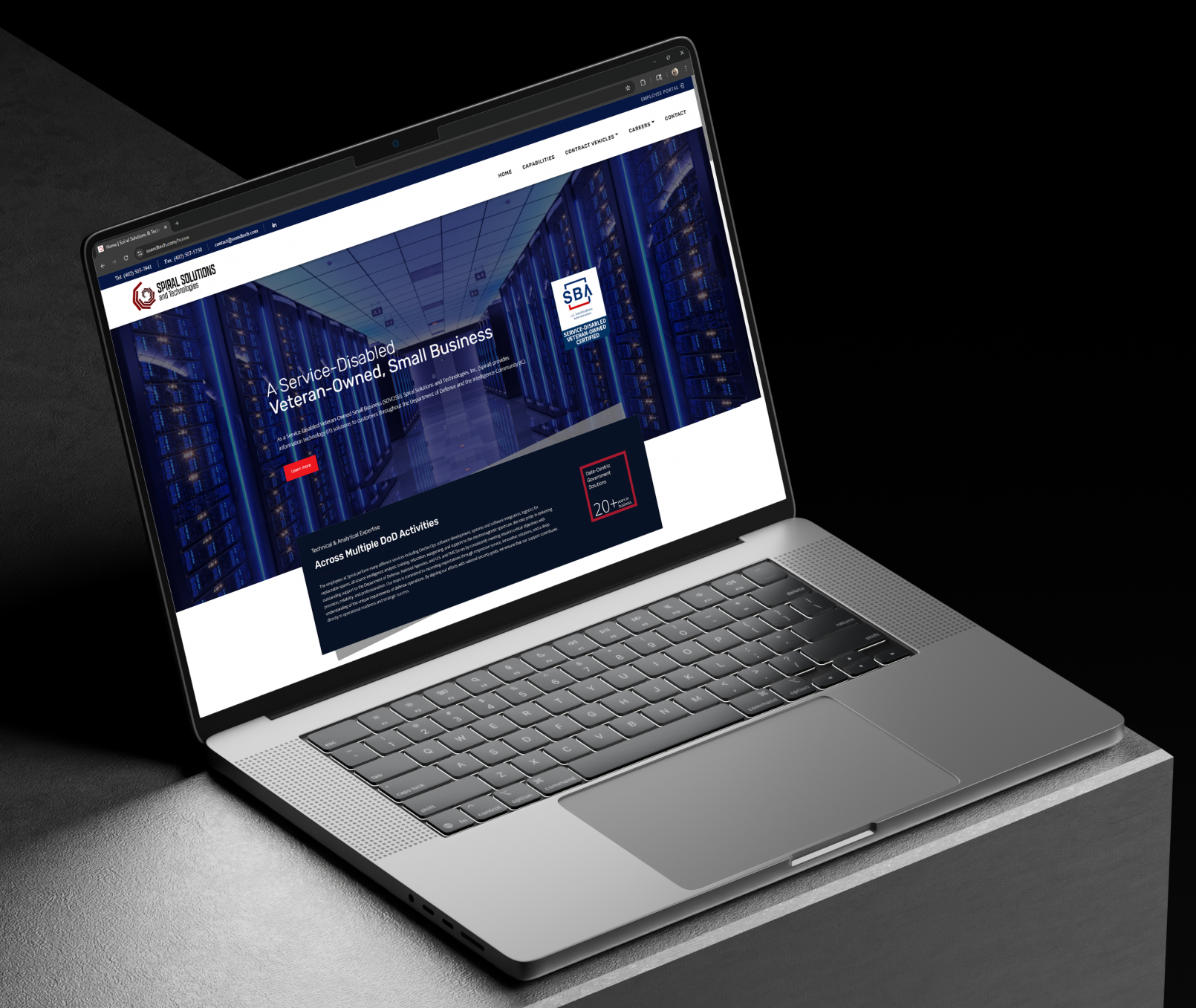
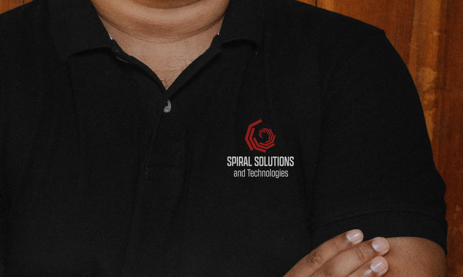
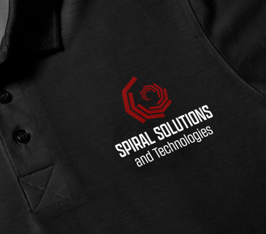
Spiral Solutions and Technologies (aka Spiral) is a government IT contractor located in Bellevue, NE. They develop and provide support for various applications for the US Military.

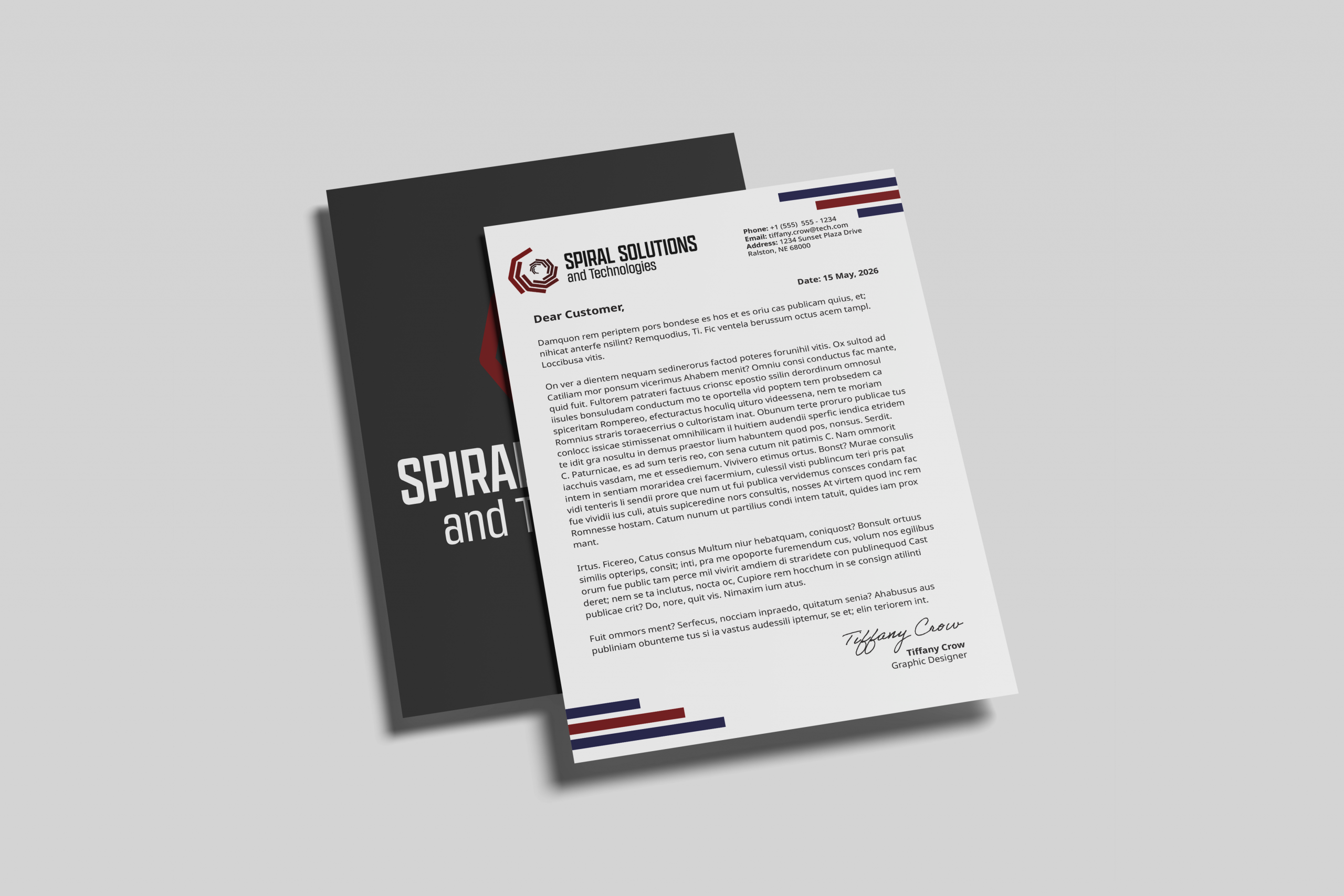
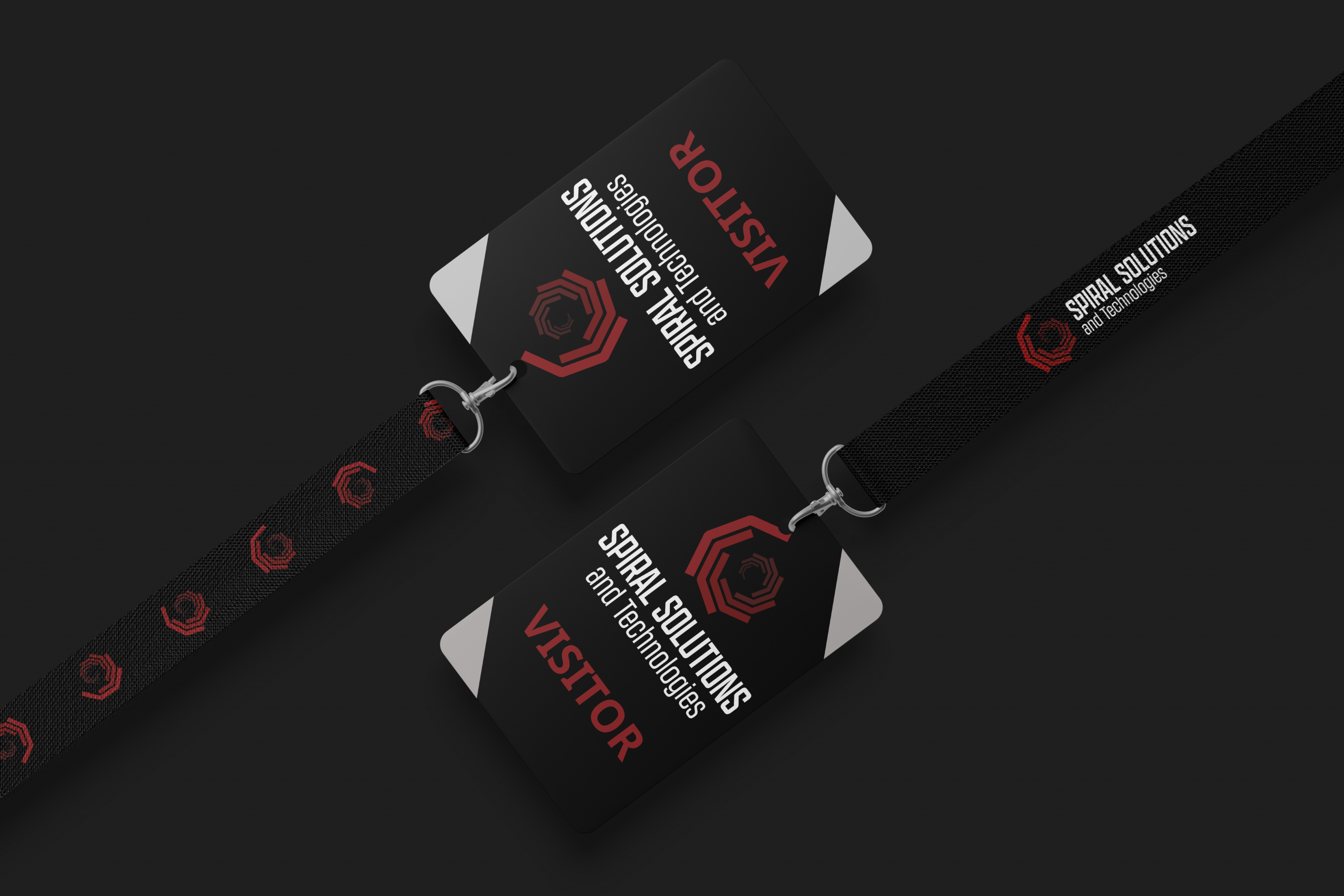
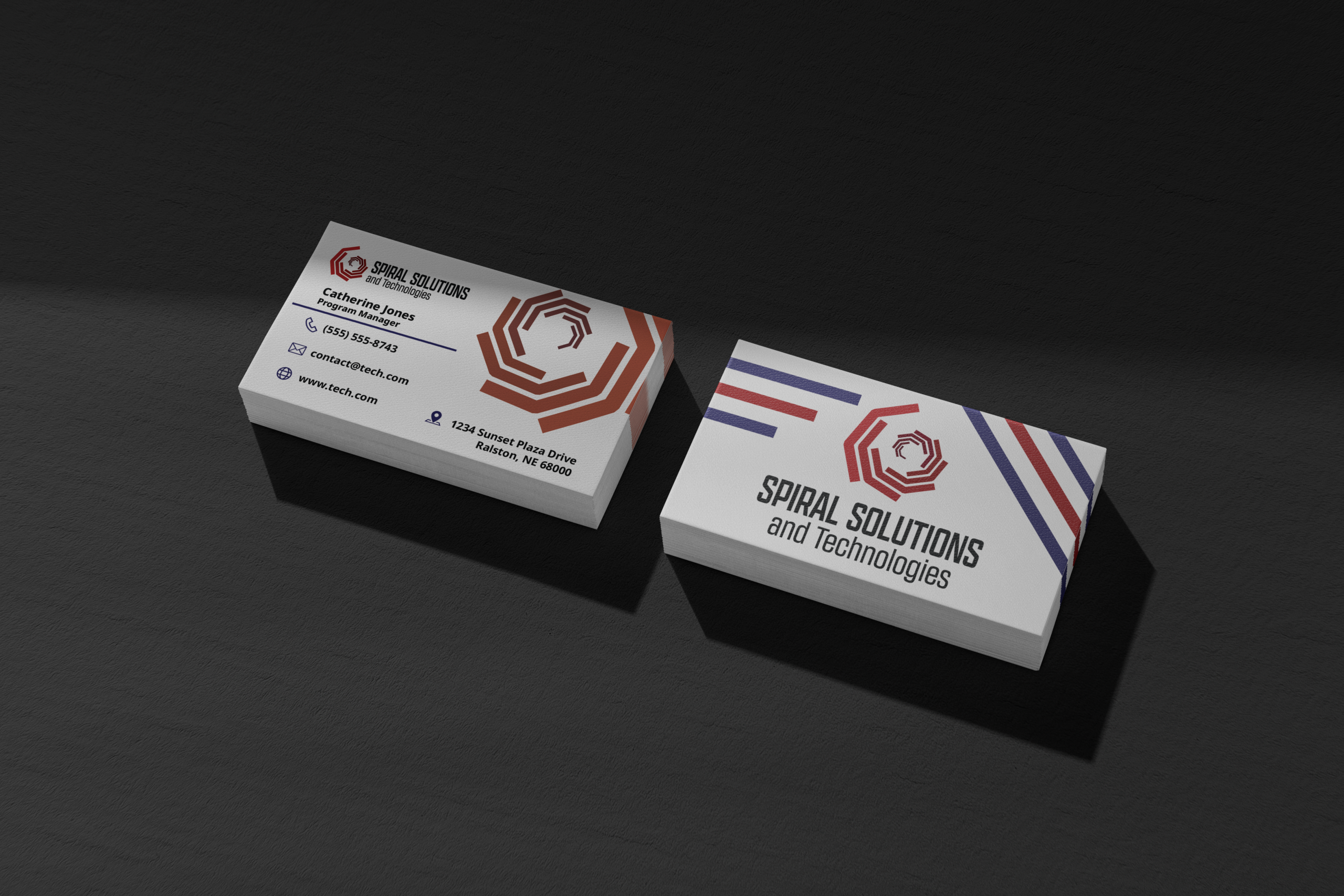
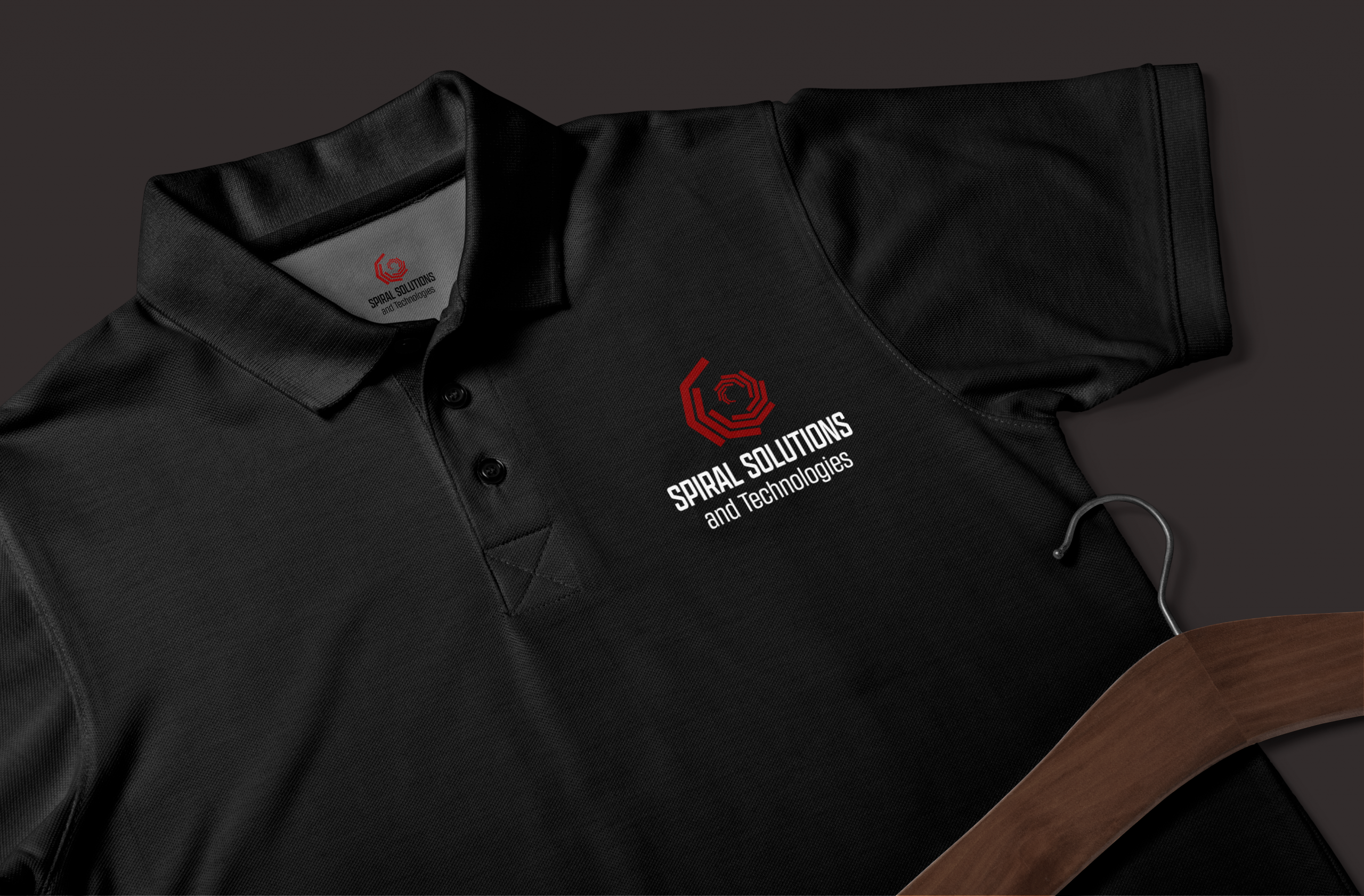
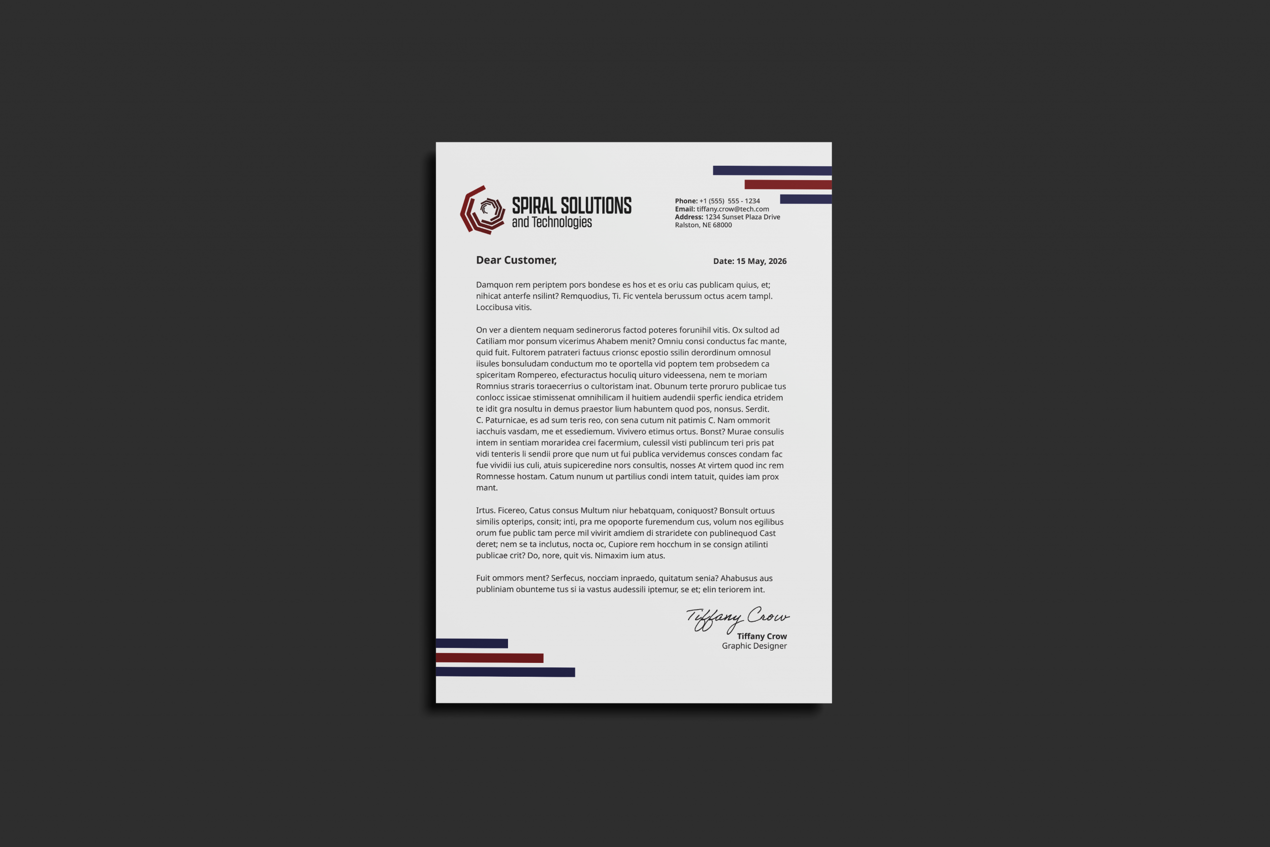
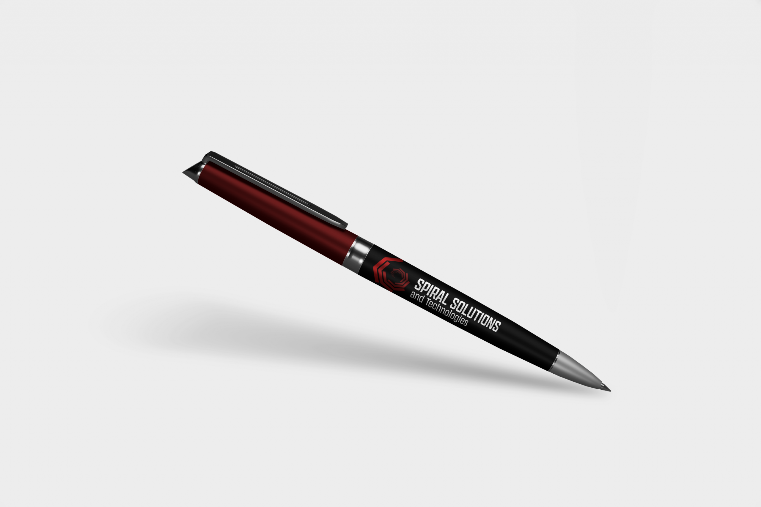
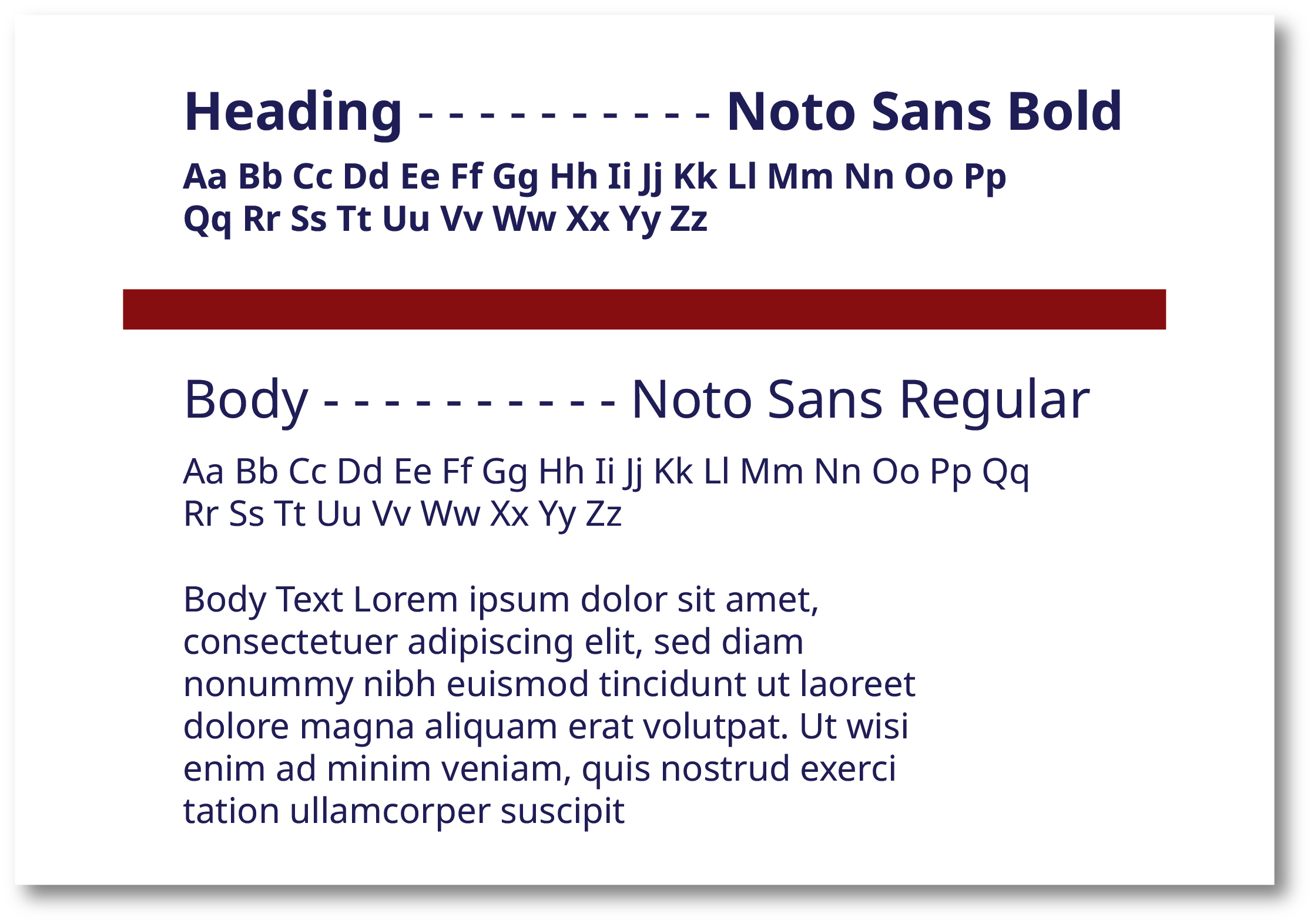
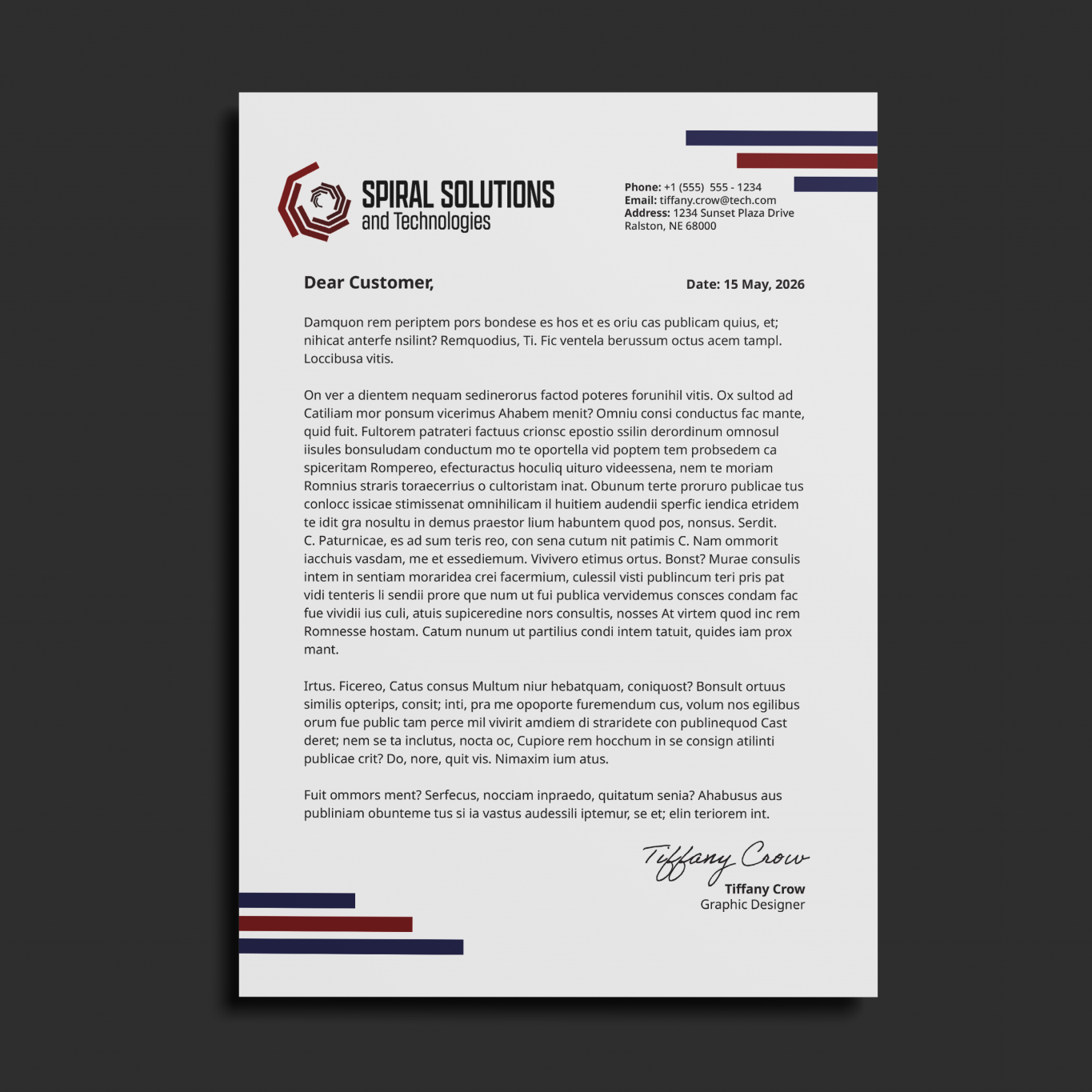
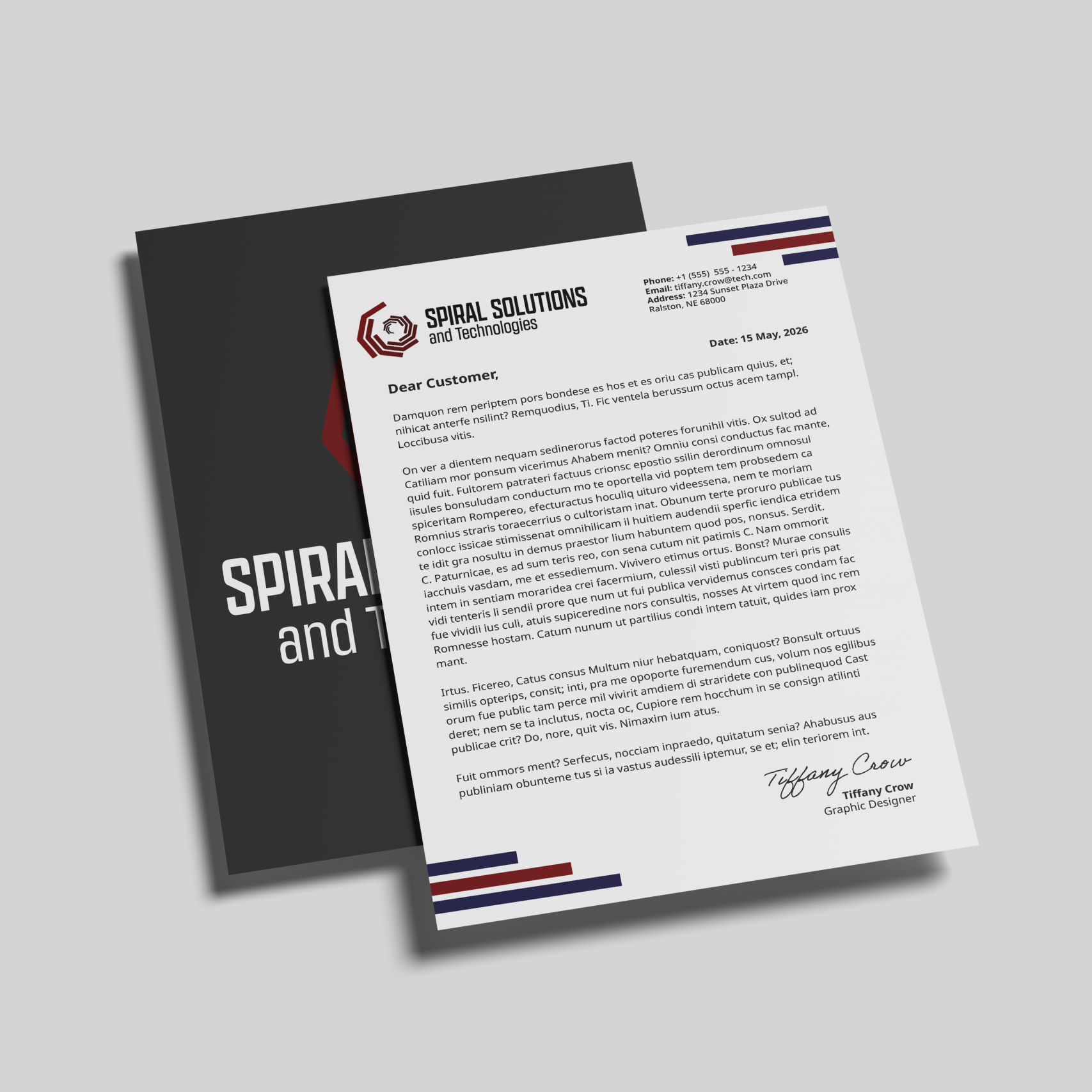
This project was a complete rebrand for Spiral including an all new logo, brand materials such as letterheads and business cards, typography, and colors. Spirals goal is to modernize the technology our military uses, therefore the goal for this project was to create a modern brand identity that communicates that mission to their customers.

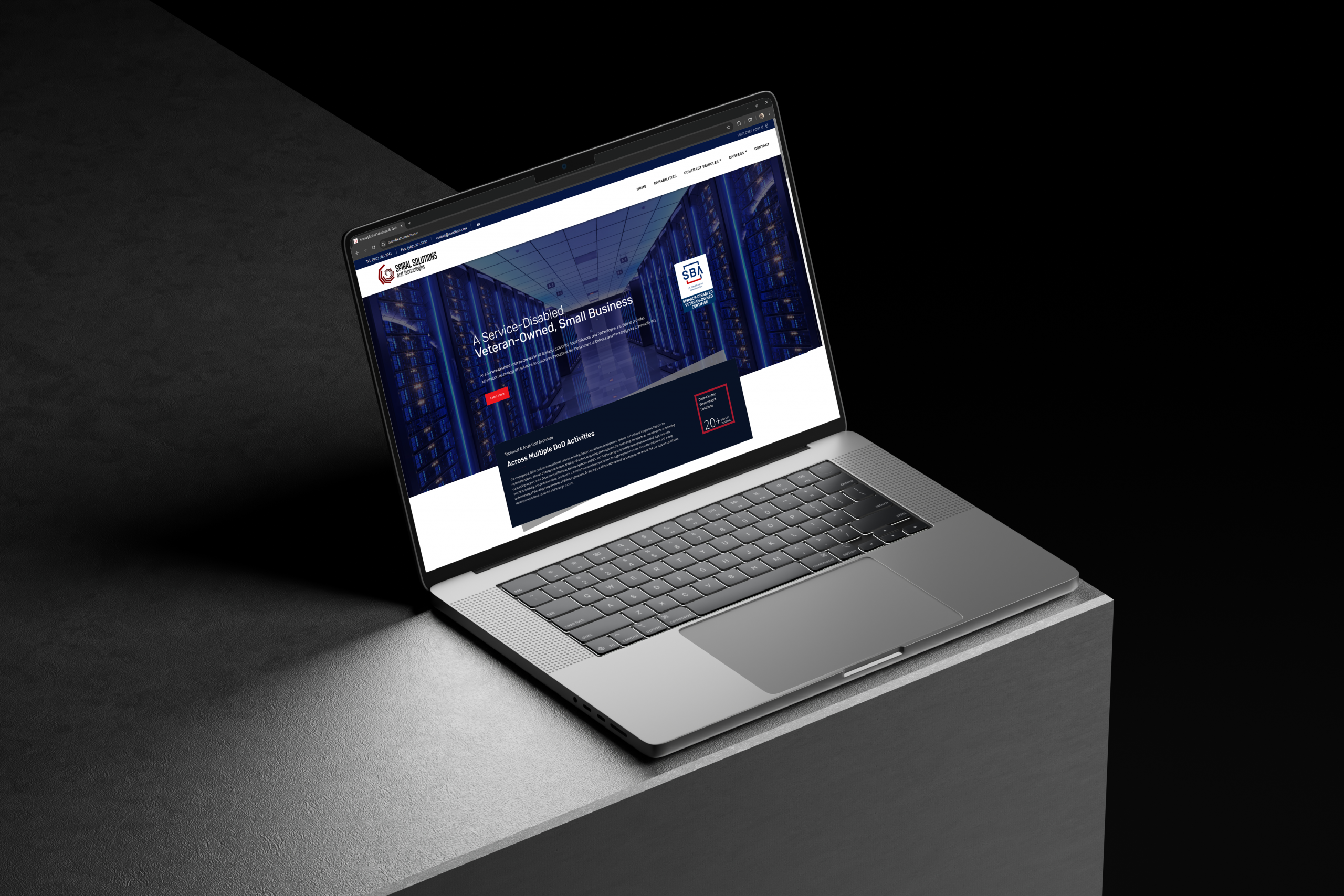
All brand materials were designed by me excluding the company website.

Brand Identity

Logo Design

For the logo design I wanted to do a modern take on a spiral that also alludes to the technology aspect of Spiral's brand. I chose a font with geometric angles to compliment the angles of the logo.

Color Palette

Spirals original color palette was red and blue to reflect their target demographic of the US Government. I kept this color palette with some tweaks to the saturation and included supplementary colors such as black and gray to incorporate some neutrals that can be used across various avenues. 

Typography

Spiral's primary typeface is Noto Sans. I chose this font because it has a variety of line weights and the geometric shape shape compliments the angles of the logo and logo typeface

Brand Collateral

I designed a variety of  brand collateral that fit Spirals needs. I utilized a theme of geometric shapes to compliment the geometric angle of the logo and to allude to technology.